Wednesday, 23 May 2012

Using HTML

Using HTML for web design
In this tutorial we learnt the process of making a basic website using HTML code in Adobe Dreamweaver. We covered how to set-up new pages, create link to pages, using tables, inserting images and previewing the website in your browser. 


First of all you should go File > new > HTML

Now go Site > New Site give it a name and select a root folder for it (The folder can be anywhere)

Make sure to re-name your documents at save them, or else this will look unprofessional on the final website. The first document should be a index.html always, this is the home of your website. 

Create as many more pages as you want and repeat the process, in this case I've created an 'About' and 'Contact' page.
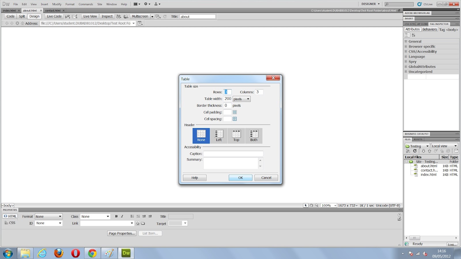
At this stage go to insert > table and change the settings as you wish and hit 'OK', this should create a table on the document you are on.

You can now also import images to the document by saving them to your root folder (The one you made at the start), they should now appear in the library - if not refresh with 'F5'.

You can now drag the images from the library into the cells in the table, as shown here. In this case I used some .Gifs I got online. You should be able to see them there. 

Now, I create a new HTML page called 'Large_01' and place a large image here from my library. 

I head back to my other page (About page) and go Window > Behaviour. This should open a new tab on the right, now you can click the small + icon and choose 'Open browser window' with one of the cell selected. This should open a window of options, in the 'URL to Display' browse to the 'Large_01' HTML we made, this creates a link between the two. You can change the other settings if you wish. 

To make the audience aware we can click on the small image, we add a '#' to the Link tab in the bottom tool bar as shown in this image. Now a hand-cursor will appear when you roll over it. 

Now if you preview it by click the small globe icon at the top tool bar then > Preview in Chrome etc.. You will see a working draft of your website and you now should be able to click one of the images and make a new larger image of it pop up in a new window. 

If you want to you can create new page, call them what you want. Then back on your index page, you can create links to your other pages byconnecting them on the 'Links' toolbar a the bottom of the page - you can have as many as you want.


Wednesday, 16 May 2012

File Formats

File Formarts For Mobile & Web Devices
When mobile & web comes into play, there are certain procedures you should take into account. With mobile internet speeds not being as fast as our broadband, It takes longer to load an image on a website. Therefore optimizing the image to have a lower file size would make it load faster - a much better experience for the audience.

Depndant on the type of image, there a three different file formats you generally always should use. JPEG's are used for more photographic images & images with gradients. GIF's are used for images with block colours and not great detail. PNG's are used for images that require transprancy.

JPEG
Pros:
- Low File Size
- Adaptable quality
- Good for photographic images

Cons:
- Loses quality & data of an image
- Cannot hold transparency
- Cannot be lossless


GIF
Pros:
- Great for block coloured images
- Can hold transparency data
- Low file size

Cons:
- Not good for detail/photgraphic imagery
- The transparency is limited
- Compresses images

PNG
Pros:
- High quality transparency
- Good for Flash
- Versatile for web design

Cons:
- Higher file size
- Compresses the file
- Does not support animation

Here you can see the difference between file formats. JPEG is smooth at only 40% quality, therefore it is very versatile for devices - it can look good at come at a low bandwidth cost. GIF you can see is poor quality, it shows grain and loss of colours. This is because GIF has a small limit on the number of colours it can show. The maximum is 256 colours, but in this image it shows it at 32 colours. And finally PNG, it is good quality, but comes at a higher file size, JPEG would be more ideal as there is no transparency and a variety of colours. 

Wednesday, 25 April 2012

Website research

Website Navigation & Layout Reasearch
The BBC is one of the most famous news institution's in the world. They encounter millions of website hits each day and must be able to inform their audience in a quick and informative fashion. The purpose of the BBC is to provide information on what's happening around the world, in order to successfully do this they have to make sure their content easily accessible on a variety of devices. 

This is the desktop version of the BBC's website, it's minimal, clear and easy to use. It's laid out in an orderly way, with the main headlines in the standing out amongst the rest of the website. I believe this is one the main purpose of visiting the BBC website, therefore having it as the main element of the homepage would make sense. Further to the top of the we have the weather forecast and the time, again this is quick and easy way to access information you may be seeking. The interface includes a number of categorised links to different areas of the website - this includes TV schedules, Sport, Weather etc. What's great about the BBC's homepage is that you can get a majority of the information you may need all from one page, as it manages to fit it all in small chunks. 

Furthermore, if you click on a particular article you get a detailed page on the information you want, including different forms of media - such as videos. It also has links on a side bar to different articles which may interest you, like the most popular articles read that day and featured articles. Doing this is informative for the reader and also keeps them using the website. They do also include sharing buttons for Facebook, Twitter and other social networking sites - this gets the audience commenting and debating on particular issues through out the world.

This is the mobile version of the BBC website, it's a much more streamlined and user friendly layout compared to the desktop version. It is more about giving straight up information which is generally the main use for surfing the web on a mobile. The layout scales down and up for the resolution you're viewing it at, therefore the mobile version can be used for multiples devices - including a tablet. This is a feature that the desktop version does not have. Furthermore, it has a lower bandwidth cost due to it being more optimised for the type of device it is.

The version of the BBC has less features than the desktop, as it is unnecessary and better for a mobile device to keep things simple and easier to run as it has less hardware resources.

The mobile version has categorises of news, sport and weather  all on one page, I think this is due to the fact, it would be much more ideal to get all the information on one page. Because generally when browsing online on a mobile you don't want to have spend lengthy times reading, quick and minimal texture tends to be the better and easier choice.

In conclusion, I can see that there are big differences between the desktop & mobile version - both with there own pro's & con's. The obvious one is the layout is different, which is mainly for accessibility purposes. But, you have to take practicality into account, it's not always easy to find a computer and log on, just to check for messages. Having the portability of a mobile to access it, is much more ideal to quickly check up when you're out. However, it's more enjoyable to browse on desktop as it's allot more visual and interactivity involved - this is because you would generally spend more time on a desktop version as opposed to mobile.

Ebay
It is a well known virtual bidding service - where millions of people go on each day. It's a great place to sell and exchange items and is used world wide. A service of this magnitude must give access to all age groups on different devices in an easy to use way.


Statistics:
Mobile internet use nearing 50%

The most rapid growth was among younger people, where 71% of internet-connected 16 to 24-year-olds used mobiles.

Just 8% of internet users aged over 65 made use of the newer technology.
Year
Households (millions)
Percentage
2006
14.3
57
2007
15.2
61
2008
16.5
65
2009
18.3
70
2010
19.2
73
2011
19
77